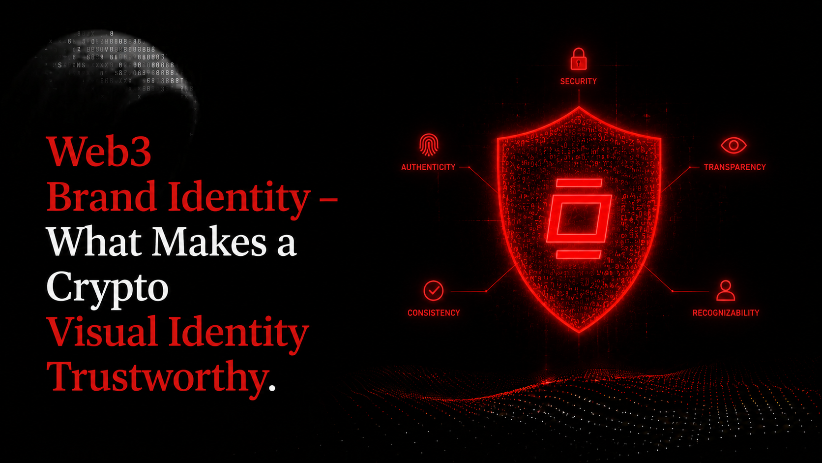
Before anyone reads your whitepaper, checks your tokenomics, or DMs your team, they've already formed a judgment based on how your project looks. In crypto, visual identity is the first compliance check. The Stanford Web Credibility Project found that 54.6% of consumers assess financial websites' credibility based on visual design, higher than e-commerce, travel, or search (Stanford Web Credibility Project, 2002). In a space where roughly half of all crypto projects ever listed have already shut down (KuCoin Research, 2024), visual identity is one of the first signals investors and community use to separate signal from noise. This article breaks down what trustworthy actually looks like in pixels, and what the red flags look like too.
Key takeaways
- Visual design is crypto's fastest trust signal: 54.6% of users judge financial websites' credibility based primarily on visual design (Stanford Web Credibility Project, 2002).
- Roughly half of all crypto projects ever listed have shut down - many shared the same visual red flags: no coherent system, stock-asset logos, mismatched typography (KuCoin, 2024).
- Strong crypto brands (Coinbase, Chainlink, Ethereum) share one trait: system thinking over decoration.
- Brand identity sequencing matters - visual work done before positioning is expensive guesswork.
Why visual identity is a trust signal, not just branding
In crypto, visual identity is a credibility shortcut - a fast heuristic investors and community use before reading a word of copy. Research from Google found that users form a first impression of a website in as little as 50 milliseconds, based entirely on visual factors: layout, color, and typography (Google, 2012). In a market with no regulatory backstop and no FDIC insurance, that first impression carries unusual weight.
The Stanford numbers are worth taking seriously. At 54.6%, visual design concerns in financial services outpaced every other web category in the study. In e-commerce the comparable figure was 46.2%. The gap exists because the stakes feel higher: people are deciding whether to trust a system with real money. Crypto amplifies this because the trust signals present in traditional finance - brand recognition, physical presence, regulatory logos - are absent or unverifiable.
Color alone shapes a large proportion of those initial judgments. Research from the Institute for Color Research suggests that 62–90% of first product assessments are based on color within 90 seconds of exposure (Institute for Color Research, foundational research). For a crypto project, the choice of primary color is communicative. Coinbase blue signals institutional. Uniswap pink signals DeFi-native. Chainlink blue-on-dark signals infrastructure. Those choices were made deliberately.
The institutional money is paying attention to this. EY's 2025 Digital Assets Survey found that 86% of institutional investors already have or plan digital-asset exposure, with trust and security ranking as the top factor in platform selection (EY Digital Assets Report, 2025). Institutional due diligence now treats brand coherence as a proxy for operational discipline.
The part most competitors won't say directly: some rug pulls invest in slick design. The Frosties NFT project had professional brand assets. So did Evolved Apes. Visual coherence is table stakes. But visual incoherence is almost always a red flag. The logic is asymmetric: good design doesn't prove legitimacy; poor design is strong evidence against it.
In a Stanford Web Credibility Project study, 54.6% of financial website users cited visual design as their primary credibility assessment factor, outpacing e-commerce (46.2%) and every other measured category. In crypto - where no regulatory backstop exists - this trust gap is filled entirely by visual signals. (Stanford Web Credibility Project, 2002)
The 5 rug-pull visual red flags (and what to do instead)
These five visual patterns appear across the majority of crypto projects that failed or were later identified as scams. None alone guarantees fraud, but together they form a risk profile sophisticated investors recognize instantly. Pattern recognition.
Red flag 1: Stock vector or clipart logo. This is the most common and most costly signal to send. A stock icon from Flaticon or Shutterstock costs nothing, and that's exactly what it communicates. Investors who've seen hundreds of token launches recognize stock art immediately. It signals one thing: the team didn't invest in this project enough to commission original work. Even a minimal custom logomark, a simple geometric symbol designed specifically for your project, signals commitment. The financial outlay for a basic custom logo is small relative to the trust signal it purchases.
Red flag 2: Inconsistent color system. Different shades of blue across your website, your social profiles, and your pitch deck. No defined palette, no hex codes, no system. This pattern signals that no one is in charge of how the project represents itself. Operational discipline and visual discipline correlate. When investors see five shades of blue across five touchpoints, they wonder what else isn't aligned. Define three to four brand colors with precise hex values and apply them consistently across every surface.
Red flag 3: Gradient overuse. The galaxy-brain aesthetic: neon gradients, purple-to-pink transitions, everything glowing. It reads as speculative. It's the visual language of hype cycles. Gradients work when used sparingly as accent elements or hover states. They fail when they become the primary brand color, because they're impossible to apply consistently and they age badly. Use them as accents.
Red flag 4: Copied design patterns from known low-quality launches. Certain layout templates, countdown timer formats, and hero image compositions have become strongly associated with low-quality token launches. Sophisticated investors pattern-match these instantly. It's the visual equivalent of a boilerplate whitepaper. Look outside crypto for layout inspiration. Fintech, SaaS, and enterprise software products have visual systems that signal credibility. Reference those.
Red flag 5: No coherent system across channels. Your Twitter profile looks different from your website. Your Telegram has no branded assets. Your Discord banner is a different color than everything else. This fragmentation signals no design authority and no operational process. Before launch, build a minimum social asset kit: profile image, banner image in correct dimensions for each platform, and a set of post templates. Consistency costs very little once the core system is defined.
What strong crypto visual identities have in common
The visual identities that earned lasting trust in crypto share one underlying principle: they were built as systems. Consistent branding across all platforms can increase revenue by up to 23% (Lucidpress Research, 2019). The projects with the strongest brand equity didn't get there by having the best logo. They got there by applying a coherent system everywhere, at every scale, for years.
Coinbase open-sourced its design system (CDS) built on modular architecture with design tokens. The institutional blue palette and clean typographic hierarchy communicate one thing: we're for serious people doing serious things. The 2025 visual evolution shifted from abstract illustration to authentic photography - a deliberate move toward humanity and accessibility as the user base expanded beyond early adopters. It's a system adapting within its own principles.
Chainlink built a logomark around the hexagonal shape, instantly legible in a social feed and at 16-pixel favicon size. It works at billboard scale and at token-icon scale without modification. That kind of scale-invariance isn't an accident. It's a design discipline decision made early, and it's paid dividends every time the Chainlink hex appears in a wallet or aggregator interface.
Ethereum Foundation holds what is arguably the most recognized symbol in crypto: the diamond mark. Geometric simplicity, infinite scalability, zero cultural baggage. The brand is effectively decentralized - used by thousands of projects in dozens of contexts - and it holds because the underlying geometry is so clean that nothing clashes with it. No other protocol has achieved that.
Uniswap made a different choice. The unicorn is playful and precise. It signals "DeFi-native" without trying to look like a bank. The pink is deliberate differentiation in a sea of institutional blue. In a crowded category, distinctiveness is a strategic position.
In n3xtgrowth's review of 30+ crypto projects, the common thread among projects whose brands failed them wasn't the logo. It was typography and cross-channel consistency. Projects that scored well on logo quality but poorly on system discipline almost always showed it in the same place: the pitch deck looked nothing like the Discord. Investors noticed, even when they couldn't articulate why.
Consistent branding across all platforms can increase revenue by up to 23%, according to Lucidpress brand consistency research. In crypto, where investor due diligence happens across website, social channels, pitch decks, and community platforms simultaneously, that consistency premium translates directly into trust signals at every touchpoint. (Lucidpress Research, 2019)
The web3 brand identity system - what you actually need
Most crypto projects launch with a logo and a color palette. That's roughly 20% of a complete brand identity system. Brands with consistent visuals can see revenue increases of up to 33% (brand consistency research, 2019). The remaining 80% isn't decoration. It's the operational infrastructure that keeps the visual system coherent as the team, community, and media presence scale.
The complete deliverable set, and what each piece actually does:
| Deliverable | Trust function |
|---|---|
| Logo system (primary / icon / wordmark) | Recognizability at every scale from favicon to billboard |
| Color palette (primary + secondary + semantic) | Visual coherence; color psychology signaling |
| Typography system (heading + body + UI) | Signals craft and attention to detail at the micro level |
| Iconography style | System coherence across docs, decks, and UI |
| Photography / illustration direction | Controls emotional register |
| Motion guidelines | Increasingly visible in Web3 (token animations, loading states) |
| Social asset templates | The operational layer - what ships every day |
| Brand guidelines document | The compliance layer - keeps the system intact as team scales |
Typography is the most underrated trust signal in crypto. Projects using system fonts (Arial, Helvetica defaults, Google Docs defaults) in their whitepaper or pitch deck signal that no design authority has touched the project. It reads as a lack of investment. Custom or licensed typefaces signal the opposite: someone made a deliberate choice, that choice cost money, and that signals commitment.
Motion guidelines matter more than founders expect. Tokens now appear in wallets, aggregators, and DeFi interfaces with loading states, hover animations, and transaction confirmations. A project with no motion guidelines produces inconsistent animation across these surfaces. A project with motion guidelines produces a coherent experience that reinforces brand identity at every interaction.
Brand identity vs. brand strategy - what comes first
Most crypto projects start with the logo. This is backwards, and it's expensive. Visual identity built before positioning is decoration without direction. When the project's market position shifts, the visual system breaks. That's why most crypto rebrands happen: the visual was done before the strategic thinking, and then the strategy changed.
The correct sequence: positioning first, then voice and narrative, then visual identity. Positioning answers what market position this project owns, what category it defines or competes in, and who the primary audience is. Voice and narrative answers what the brand says, how it says it, and what language signals in-group membership. Visual identity comes third - it expresses positioning and voice in a system that travels across every surface.
A rebrand at Series A costs five to ten times more than getting the sequence right pre-launch. The visual work has to be redone, the community has to be re-educated, and the inconsistency between old and new assets creates a trust gap during the transition. Getting the sequence right isn't just a creative preference. It's a financial decision.
The n3xtgrowth sequence is: position first, voice second, visual identity third, launch readiness audit before shipping.
The launch readiness visual checklist
Before a crypto project ships its public presence, these 10 visual identity elements must be in place. Missing any creates a trust gap that sophisticated investors and community members notice - even if they can't articulate exactly why something feels off. That feeling of "off" is pattern recognition working correctly. It registers visual system failures before the conscious mind labels them.
Run through this checklist before your public launch, not after:
- [ ] Custom logomark (not stock, not Canva's logo maker)
- [ ] Logomark works at 32x32px (legible as token icon on CMC and CoinGecko)
- [ ] Defined color palette with hex codes (primary, secondary, background, text, semantic)
- [ ] Typography system defined (heading, body, size/weight scale)
- [ ] Website visual system is consistent (no rogue colors, no mixed font families)
- [ ] Social profiles complete and consistent (profile image, banner, bio across all channels)
- [ ] Pitch deck uses brand system (same colors, type, visual register as website)
- [ ] Whitepaper/docs use brand typography (not Google Docs default)
- [ ] OG/social sharing images are branded (link previews show proper brand assets)
- [ ] Brand guidelines document exists (even a one-pager)
Most projects we audit score six out of ten. The four items that consistently fail are items seven through ten: the pitch deck, the whitepaper typography, the OG images, and the brand guidelines document. These are the exact surfaces where institutional investors and serious community members spend the most time. They're also the cheapest to fix, relative to their trust impact.
Frequently asked questions
How much does web3 brand identity design cost?
A minimum viable identity runs $3,000–$8,000 with a freelance specialist. A full brand system from an agency costs $15,000–$50,000+. The investment is defensible: projects with consistent branding see up to 33% higher revenue (Lucidpress Research, 2019), which means the ROI math tends to work in your favor before launch.
What makes a good web3 logo?
A good web3 logo is a system. It needs three versions: primary lockup, icon-only, and wordmark-only. The icon must be legible at 32x32px, the size it appears as a token icon on CoinMarketCap and CoinGecko. A logo that only works at large size isn't a logo system. It's a single asset.
Do I need a full brand system before launch?
You need a minimum viable brand before launch. That means five things: a custom logo system, a defined color palette with hex codes, a typography system, branded social profile assets, and OG/sharing images. You can't skip those five. Everything else - illustration style, motion guidelines, iconography - can follow after launch.
Can a crypto project with a great logo still be a scam?
Yes. Several 2024 rug pulls had genuinely professional branding. Visual quality is a necessary signal but not a sufficient one. Pair visual assessment with team verification, tokenomics audit, and on-chain transparency checks. Good design raises the floor. It doesn't guarantee legitimacy.
How does typography affect crypto brand trust?
More than most founders expect. System fonts (Arial, Helvetica defaults, Google Docs defaults) in docs and decks signal that no design professional has been involved. Custom or licensed typography signals that someone invested in the details. Investors read that as a proxy for how you handle everything else in your project.
Before the next raise, fix the visual layer
Visual identity is the first pitch your crypto project makes - before anyone reads a word of copy, before tokenomics are reviewed, before the team page is clicked. In a market where roughly half of all crypto projects ever listed have already shut down (KuCoin Research, 2024), getting this layer right isn't optional.
The goal isn't to look good. It's to look like you care about the details, because that's what signals to investors and community that you'll care about the details that really matter: security, tokenomics, governance, execution.
A coherent visual system won't save a bad project. But an incoherent one will sink a good one faster than almost anything else in your control.
We've seen this pattern consistently: projects with strong fundamentals and weak visual systems struggle to convert institutional interest into actual commitments. The visual layer is often the last thing they fix. It should be one of the first.
This content is for informational purposes only and does not constitute financial or investment advice. Cryptocurrency investments carry significant risk. Always conduct your own research before making investment decisions.